Hidden Threat - Vulnerability Analysis using the news graph

When you face to face a new vulnerability, what is the thought that comes first? Of course, respond as quickly as possible. However, speed is just one of the conditions for an effective fight against information security threats. When it comes to corporate security, it is equally important to determine without error what you should respond to first. An underestimated threat can cause serious damage or loss of reputation. But if the count of vulnerabilities is constantly growing, can you quickly assess their significance and not miss crucial details?
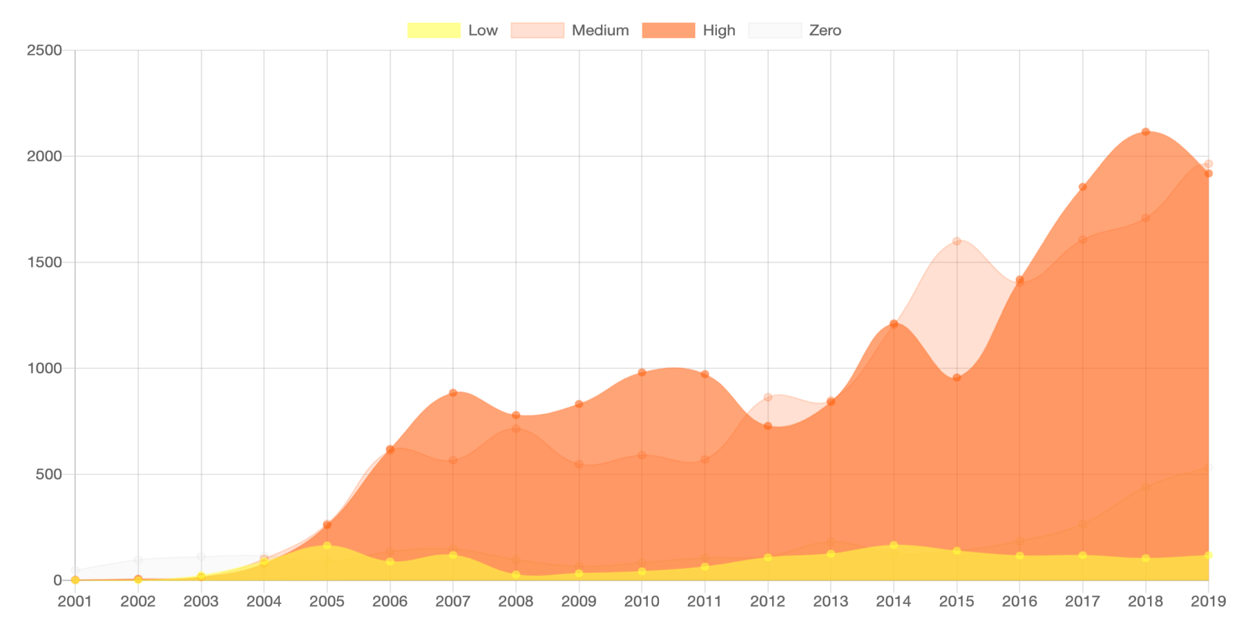
Vulnerability dynamics by CVSS group (source - vulners.com)
The CVSS Score (Common Vulnerability Scoring System) scale is typically used to rank vulnerabilities by various criteria, ranging from operational complexity to harm and other parameters.
It would seem why invent something else - but the CVSS Score has one weak point - it is based on expert evaluations not supported by real statistics. It would be much more effective to offer experts cases that were already selected according to certain quantitative criteria and make decisions based on verified data - but where to get this data and what to do next? It sounds like an unusual and interesting task for a data scientist - this challenge inspired Lydia Khramova and the Vulners team to create a new concept for assessing and classifying vulnerabilities based on a graph of related information.
Why graphs? In the case of social networks and the media, graph methods have been successfully used for a long time for various purposes: from analyzing the distribution of content in the news stream, to notes on the impact of top authors on the opinion of readers and clustering social network by interests. Any vulnerability can be presented as a graph containing data - news about changes in software or hardware and the effects caused by them.
About data
Lydia did not have to manually collect news about each update, all the necessary texts were found in the vulners.com open vulnerability database. Visually, the data is as follows:
Each vulnerability, in addition to its name, publication date and description, has a family (NVD, scanner, exploit, etc.) already assigned to it (cve, nessus, etc.), a CVSS rating (CVSS v2 is used hereinafter), and also links on related news.
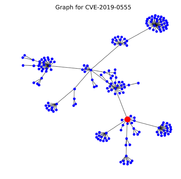
If you present these links schematically as a graph, one vulnerability will look like this: an orange circle indicates the original or parent publication, black circles - news that can be clicked on while on the parent page, and gray circles - linked news, which can only be reached by going through all the publications marked with black circles. Each color of the circles is a new level of the graph of related information, from zero - the initial vulnerability, to the first, second and so on.
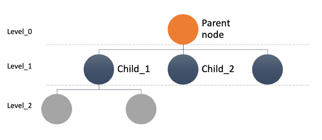
Of course, when viewing one news item, we know only the zero and the first level, therefore, to get all the data, we used the method of traversing the graph in depth, which allows you to unravel the tangle of news from the beginning to the most recent connected nodes (hereinafter - the graph node). At this stage, optimization problems accur - graph assembly over a long period took a long time and had to apply magic with both the script and the data structure. At this stage, optimization problems arose - building a graph over a long period took too much time and had to apply magic with both the script and the data structure. By the way, it was decided to pack the final data into parquet for further work with them using spark sql, which facilitated the initial analysis.
What does graph data look like? Visualization will help us best understand their nature. The figure shows a graph of the well-known, but not very dangerous vulnerability Heart bleeds (only 5 out of 10 points on the cvss scale).
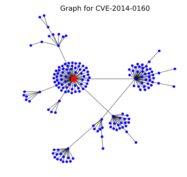
Looking at this lush set of points from related news and exploits, where the red dot is the original vulnerability, we realize that Heartbleed was significantly underestimated.
Based on this example we can conclude that consistency, duration, and other vulnerability parameters are well evaluated using graph metrics. Below are a couple of examples of metrics from the study that served as the basis for an alternative classification:
- the count of nodes in the graph - is responsible for the "breadth" of the vulnerability and its fingerprints left in various systems;
- the count of subgraphs (large clusters of news) - is responsible for the granularity of the problem or the presence of large problem areas within the vulnerability;
- the count of related exploits and patches - indicates the explosive nature of the news and how many times it had to be fixed;
- the count of unique news types and families in the graph is about systemicity, i.e. the count of subsystems affected by the vulnerability;
- the duration from the first publication to the first exploit, the time from the first publication to the last related news - about the temporal nature of the vulnerability, whether it stretches with a large tail of consequences or quickly develops and fades.
Not all metrics are described here, under the hood of the research now there are about 30 indicators that complement the basic set of CVSS criterias, including the average increase between the levels of the news vulnerability graph, the percentage of exploits at the first level of the graph, and much more.
open up gray zone
And now a bit of data science and statistics — hypotheses need to be confirmed on data, right?
For the experiment with an alternative scale and new metrics, news published in January 2019 were selected. This is 2403 newsletters and about 150 thousand lines in the news column. All source vulnerabilities were divided into three groups according to CVSS Score:
- High - from 8 points inclusive;
- Medium - from 6 incl. to 8 points;
- Low - less than 6 points.
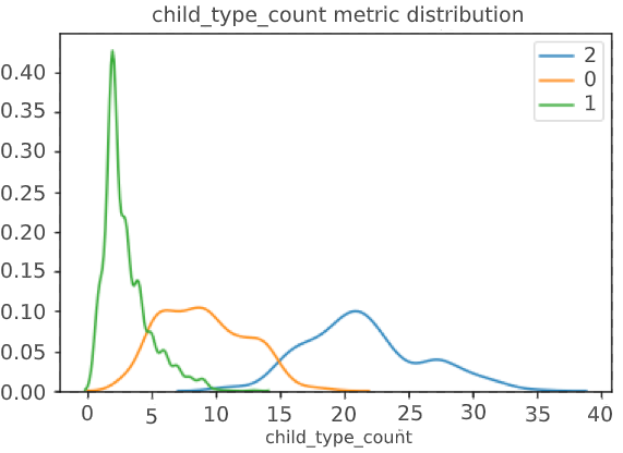
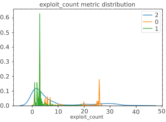
Let's see correlation the CVSS score with the number of related news in the graph, the number of news types and the number of exploits:
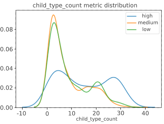
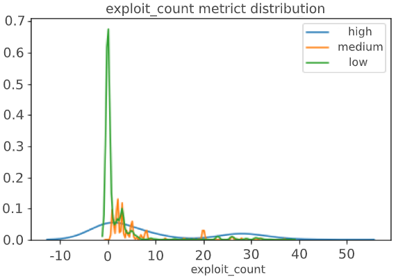
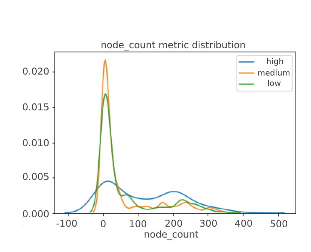
In the perfect situation, we should have seen a clear division of metrics into three clusters, but it did not happen, which indicated the possible presence of a gray area that CVSS Score does not define – this is our goal.
The next step was clustering vulnerabilities into homogeneous groups and building a new scale.
For the first iteration, a simple metric classifier k-means was chosen and a new matrix of estimates was obtained: the initial points (Medium, Low, High) are found on the Y axis, along the X, where 2 are the highest in the new vulnerability metrics, 1 are the new vulnerabilities, 0 are the smallest.
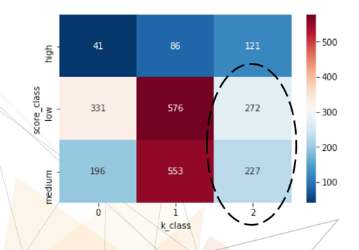
An oval-marked zone (Vulnerability Class 2 with an initial low & medium rating) —Potentially underestimated vulnerabilities. The division into new classes also looks clearer, which is what we achieved:

However, simply trusting the model is a bad idea, especially when it comes to unsupervised clustering, where the correct answer is not known in principle, and you can only rely on the separation metrics of the resulting classes.
And it is where expert knowledge is required - for testing and interpretation of the results, knowledge of the subject area is necessary. Therefore, it is advisable to point-check the model, for example, by pulling out a pair of vulnerabilities for detailed analysis.
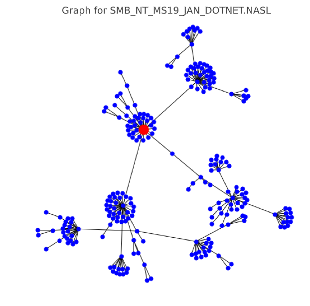
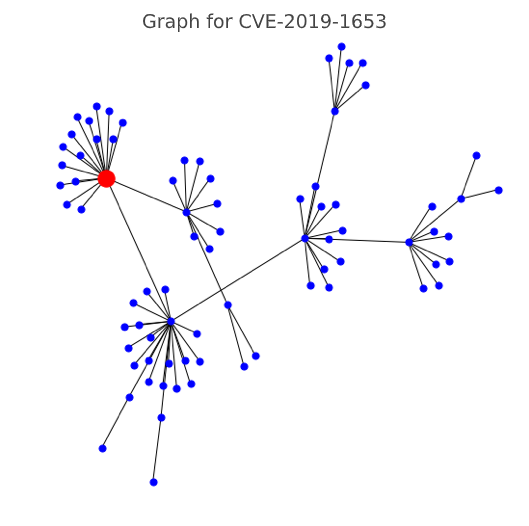
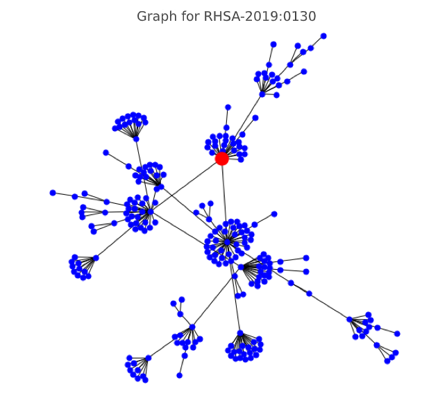
Below are a few cases from the gray zone that have a low CVSS score, but a high graph score - which means potentially requiring a different priority for working with them. Here's what they look like in a graph representation:
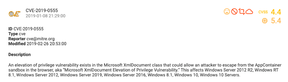
CVE-2019-0555 (CVSS score 4.4, graph class 2 - high)
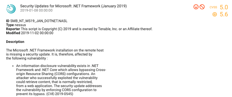
SMB_NT_MS19_JAN_DOTNET.NASL (CVSS score 5.0, graph class 2 - high)
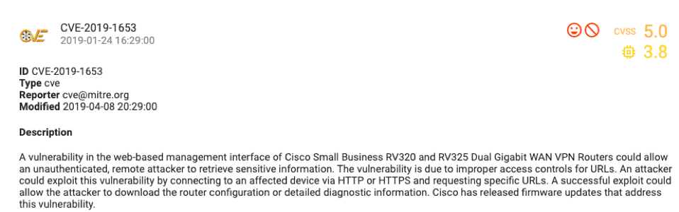
CVE-2019-1653 (CVSS score 5.0, graph class 2 - high)
RHSA-2019: 0130 (CVSS score 5.0, graph class 2 - high)
As you can see, the concept was confirmed by statistics and point verification, so in the nearest future we want to finalize and automate the collection of graph metrics, and - possible - the classifier itself. Of course, there is still a lot of work to do - from collecting a large count of new graphs for months not covered by the study, but this only adds enthusiasm, as does the essence of the task. According to Lydia, a data scientist, that the work on this research was an incredibly inspiring experience, both in terms of topic and complexity - even preparation engineering work with loosely structured data was very interesting.
In conclusion
After the study, it became clear that, first of all, a critical approach is needed not only to any metric or data, but to the process as a whole, because the world is too dynamic and changes faster than methodologies and documentation. Always evaluated in one way - why not try to shift the angle of view? As our example shows, even the most unusual hypotheses can be confirmed.
An important role is played by the availability of data for data scientists - it allows you to quickly check the most daring hypotheses and better understand the essence of your subject area in all its manifestations. Therefore, if you are not yet collecting or deleting “unnecessary” data, think about it, maybe there are a lot of discoveries lurking there. This case suggests that data driven and information security complement each other perfectly.
Source: https://habr.com/ru/post/494332/
Author: Lydia Khramova (https://www.linkedin.com/in/lydia-khramova)